For years, the debate has been simmering in ecommerce circles: which navigation pattern actually works best on a collection page — traditional pagination, infinite scroll, or a load more button? Everyone has an opinion. UX researchers publish studies. Blog posts argue both sides. And meanwhile, Shopify store owners quietly wonder what they should actually do.
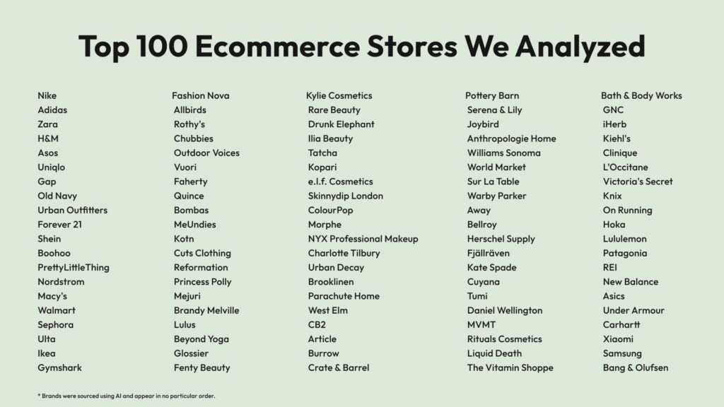
So we did something different. Instead of adding another theoretical take to the pile, we manually visited the collection pages of 100 of the world’s top ecommerce brands — from Nike and IKEA to Gymshark, Glossier, and Samsung — and recorded exactly which navigation pattern each one uses. No scraping, no estimates. One by one.
What we found surprised us. And we think it will change how you think about your own store.
What’s in This Article
- How we ran the research
- The results: what 100 top brands actually use
- Which brands use which method
- Why pagination lost — and why that makes sense
- Infinite scroll: powerful but misunderstood
- Load more button: the quiet winner
- The SEO question nobody talks about enough
- The gold standard: what ASOS gets right
- How to add infinite scroll or load more to your Shopify store
- Conclusion
How We Ran the Research
We started by building a list of 100 leading ecommerce brands spanning every major product category. We used AI to compile the initial shortlist, then refined it to ensure strong representation across verticals — from sportswear giants like Nike and Lululemon to electronics brands like Samsung and Xiaomi, from fast fashion mass-market leaders like Zara and ASOS to DTC darlings like Gymshark, Reformation, and Mejuri, from home furniture icons like IKEA and Pottery Barn to niche beauty players like Kopari and Drunk Elephant.
Then, one by one, we opened each brand’s main collection or category page and looked at a single thing: what happens when you get to the bottom?
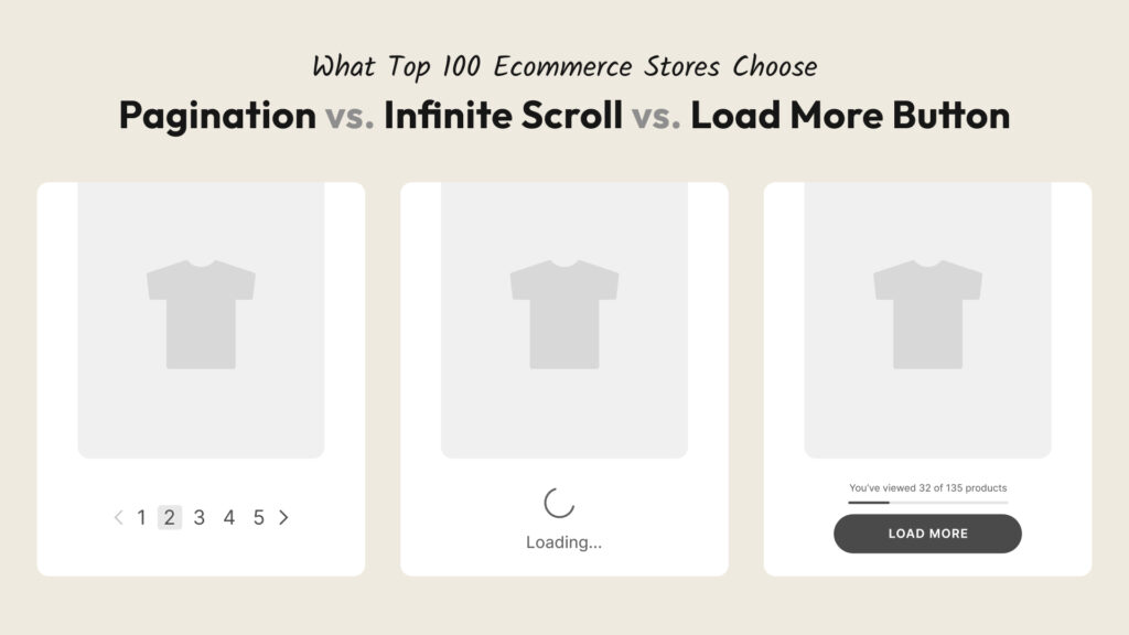
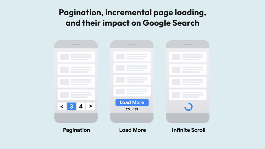
We categorized each store into one of three groups:
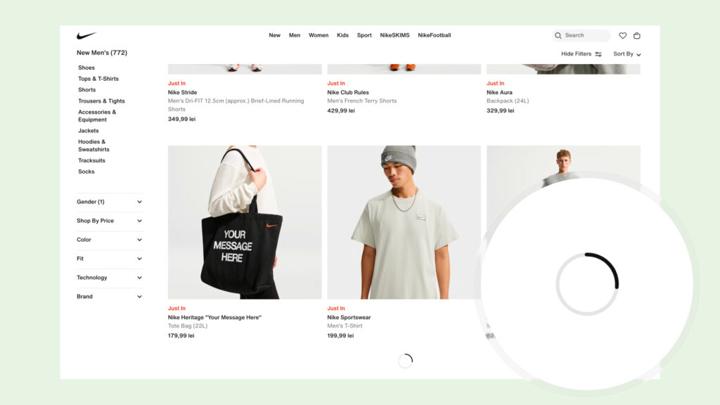
- Infinite Scroll — new products load automatically as you scroll down, with no interaction required
- Load More — a button appears at the bottom; you click it to load the next batch of products
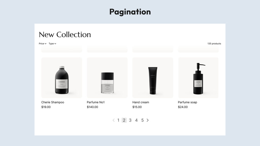
- Pagination — classic numbered pages (1, 2, 3…) where clicking takes you to a new page
Brands with very small catalogs where no navigation was needed were replaced with better-fit alternatives to keep the data meaningful. The goal was to study how leading brands with real, sizeable catalogs handle product browsing — the exact scenario relevant to Shopify merchants building a real shopping experience.
These are brands with massive engineering teams, dedicated UX researchers, and conversion rate optimization budgets most of us can only dream about. They don’t make navigation decisions randomly. Which makes their collective choices very telling.
The results: what 100 top brands actually use
After going through all 100 stores, the breakdown was:
- Infinite Scroll: 38 (38%)
- Load More: 35 (35%)
- Pagination: 27 (27%)
The headline finding: 73% of the world’s top ecommerce brands have moved away from traditional pagination. Only about one in four still uses classic page numbers.
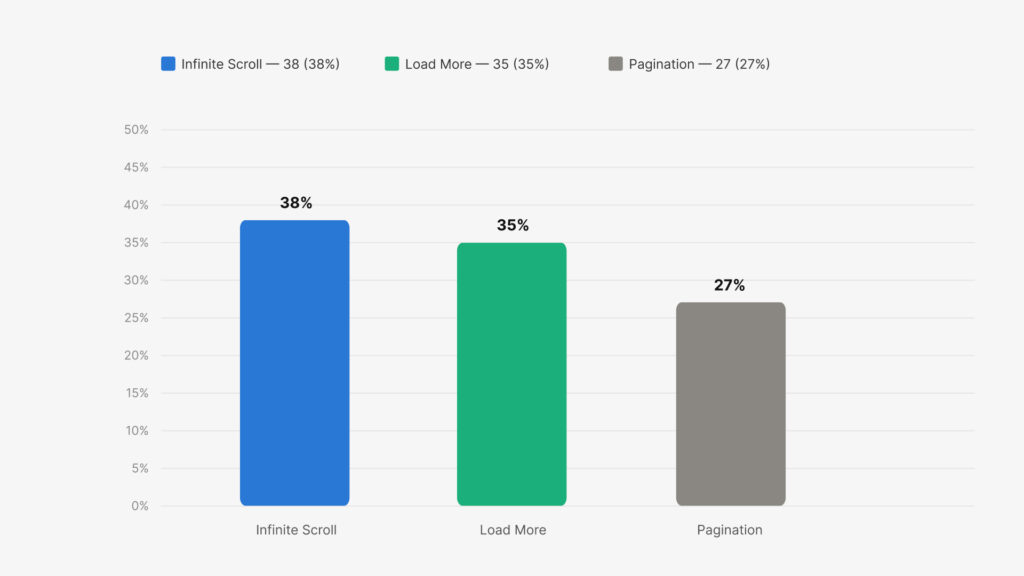
The results surprised us. Pagination was the obvious favourite going in — it’s the default on most ecommerce platforms, it’s been around since the early web, and it has a certain familiarity that you’d think brands would be reluctant to abandon. But the data tells a different story. The biggest, most conversion-obsessed brands in the world have quietly made the switch.
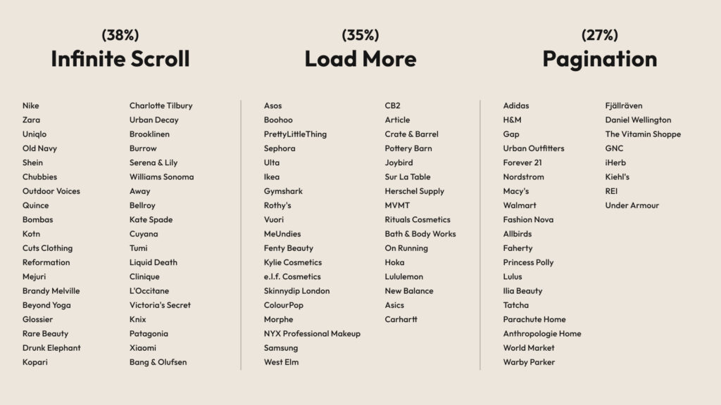
Which brands use which method
Why pagination lost — and why that makes sense
Pagination has one thing going for it: familiarity. It’s how the web worked for the first 20 years of ecommerce, it’s the default on every major platform, and it gives users a clear sense of “where they are” in a catalog.
But it has a serious UX problem that tends to hurt browsing behavior.
The Baymard Institute — widely considered the leading authority on ecommerce UX research, with over 100,000 hours of usability testing across hundreds of studies — found that users on paginated product lists browse significantly fewer products than on stores using either load more or infinite scroll. Test subjects would see a long row of page numbers and simply disengage, treating the first page as “the catalog” rather than a window into it. The act of clicking to page 2 introduces friction that quietly kills discovery.
Pagination also creates what’s sometimes called the “cold start” problem when users return to browse: after clicking into a product and coming back, they land on page 1 again, losing their place entirely. On mobile, the numbered links are notoriously hard to tap accurately. And perhaps most critically, pagination interrupts the natural flow of browsing — on mobile especially, scrolling is the dominant behavior, not clicking between pages.
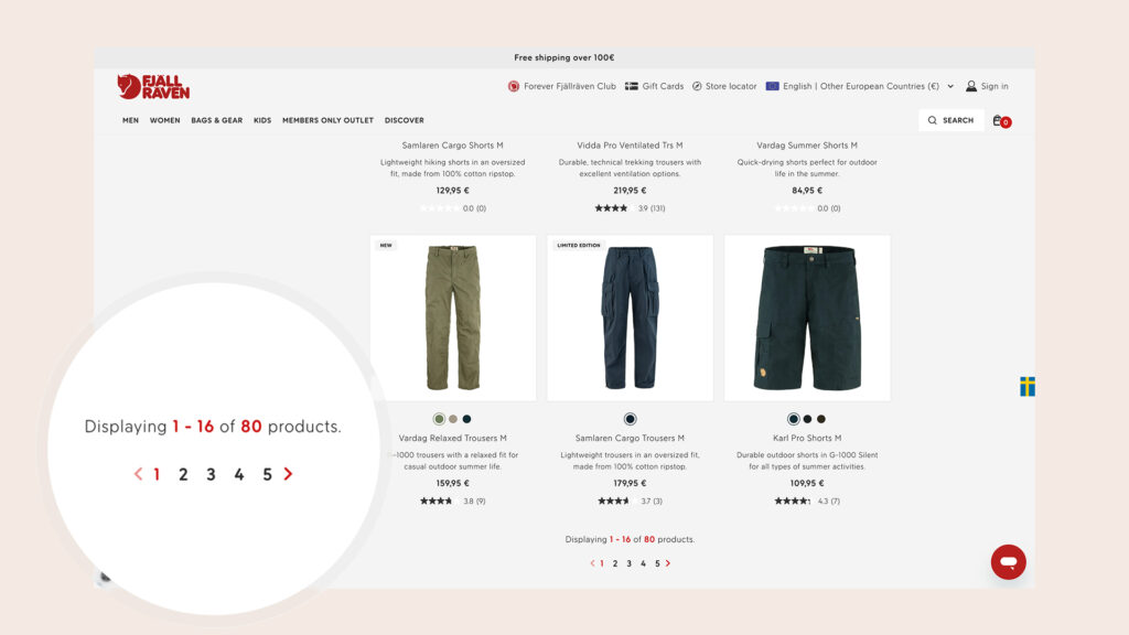
This doesn’t mean pagination is always wrong. For very large catalogs where users are doing targeted searches (imagine filtering for a specific laptop model on a tech retailer), pagination gives useful structural cues. That’s why you see it holding on at Adidas, Nordstrom, and REI — where catalogs run deep and users often come in with a specific product in mind, not a browsing mindset. But for stores where discovery and exploration drive sales, pagination is increasingly a liability.
Pros:
- Familiar to users — no learning curve
- Strong sense of position (“I’m on page 3 of 12”)
- Works well when users are searching for something specific
- Clean SEO out of the box — every page has its own URL
Cons:
- Highest friction of the three — every new page requires a click and a full reload
- Users browse far fewer products per session (Baymard Institute research)
- Losing your place is easy — click into a product, hit back, and you’re on page 1 again
- Poor mobile experience — small pagination links are hard to tap accurately
- Kills discovery flow for browsing-first catalogs
Infinite scroll: powerful but misunderstood
Infinite scroll — where new products load automatically as you reach the bottom of the page — is the most frictionless browsing experience possible. No clicks, no waits, no decisions. Products just keep appearing.
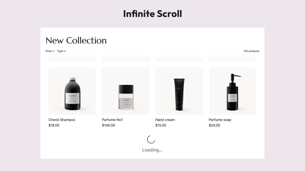
It works especially well for visually-driven catalogs where discovery is emotional and browsing is the point. Think fashion, beauty, home decor — categories where you don’t know exactly what you’re looking for until you see it. This is precisely why every major Shopify-native DTC brand in our study with a visual, fashion-forward catalog uses infinite scroll: Reformation, Mejuri, Brandy Melville, Glossier, Outdoor Voices, Chubbies, Rare Beauty. These are brands that have invested heavily in optimizing the browsing experience, and they’ve landed on the same answer.
On mobile — which now accounts for over 70% of ecommerce traffic, according to Statista — scrolling is the primary interaction. Infinite scroll meets users where they already are. There’s no page reload to cause drop-off, no small pagination links to tap accurately. Just a continuous stream of products.
The challenges come down to three things: users lose their sense of position (“how deep am I in this catalog?”), the footer becomes nearly unreachable as new products keep pushing it down, and back navigation is tricky — click into a product and hit back, and you typically land at the top of the page, losing your entire browsing context. Brands that manage infinite scroll well address the back-navigation issue directly by remembering the user’s scroll position. That single detail separates a polished implementation from a frustrating one.
Pros:
- Zero friction — products keep appearing without any user action
- Maximum product exposure per session — users see more of your catalog
- Feels completely native on mobile where scrolling is the primary behavior
- No “exit points” — no page reload to cause drop-off
- Ideal for visually-driven discovery (fashion, beauty, home decor)
Cons:
- No sense of progress — users don’t know how deep the catalog goes
- Footer becomes nearly unreachable as new content keeps pushing it down
- Back navigation typically resets to the top of the page — a major UX failure if not handled
- SEO requires careful implementation to ensure all products stay crawlable
- Can feel overwhelming or endless for users who want to compare and decide
Load more button: the quiet winner
If the data has a true story to tell, it might be this: the load more button is more popular among top ecommerce brands than most people realize — and based on the UX research, it may be the superior default for most stores.
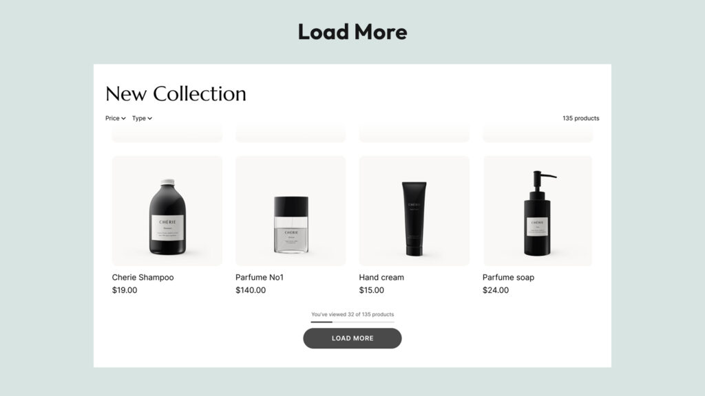
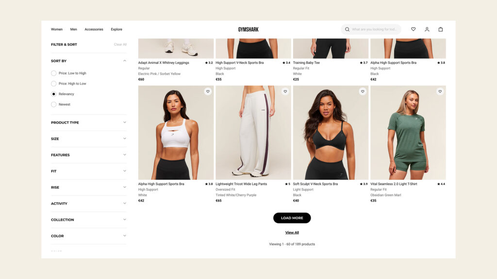
At 35% in our study, it’s just three percentage points behind infinite scroll. But look at which brands have chosen it: IKEA, ASOS, Gymshark, Sephora, Lululemon, Hoka, On Running, Pottery Barn, Crate & Barrel, Bath & Body Works. These are some of the most conversion-focused retailers on the planet, with dedicated UX teams and relentless A/B testing. They didn’t land on load more by accident.
Baymard Institute’s research explains why: a well-implemented load more button combines the best of both worlds. Users explore more products than with pagination — because products accumulate in a single, growing list rather than disappearing behind a page flip. But they engage more attentively than with pure infinite scroll — because loading more requires a small active decision, which creates natural moments of focus rather than mindless scrolling.
The practical advantages stack up. The footer stays consistently accessible, which matters for stores with important trust signals, shipping info, or navigation links there. Users get a clear sense of progress — “I’ve seen 60 of 240 products” — which manages expectations honestly and reduces the disorienting feeling that infinite scroll can create. Back navigation is handled more gracefully: when a customer clicks into a product and comes back, they typically return to a predictable point in the list, not the top of the page. And from an SEO standpoint, it’s the cleanest implementation of dynamic loading.
Pros:
- Products accumulate in a single growing list — users see more than with pagination
- Users stay in control — they choose when to load more, creating natural moments of focus
- Footer stays accessible at all times
- Product counter (“You’ve viewed 60 of 240 products”) gives clear sense of progress
- Cleanest SEO implementation of the three dynamic loading options
- Better back navigation than infinite scroll — users return to a predictable point, not the top
Cons:
- Requires one click per batch — slightly more friction than infinite scroll
- If the button isn’t prominent or well-designed, users may miss it and think they’ve seen everything
- Less immersive than infinite scroll for purely visual browsing experiences
The SEO question nobody talks about enough
Here’s where a lot of stores make costly mistakes.
Both infinite scroll and load more rely on JavaScript to dynamically load content. And Google’s web crawlers — the bots that index your pages and determine your search rankings — don’t behave like human shoppers. Crawlers don’t scroll. Crawlers don’t click buttons. They follow links.
This means that if your implementation of infinite scroll or load more simply loads new products via JavaScript without providing crawlable pagination links, Google might only ever index your first batch of products. Products that live on “page 2” or “page 3” of your original pagination — but now load dynamically — could effectively become invisible to search engines.
Google has published guidance on paginated content that makes this clear: for crawlers to index your full catalog, they need /collections/dresses?page=2 links pointing to paginated URLs. These links give crawlers a path to follow through the entire catalog.
The principle is straightforward: any dynamic loading implementation should preserve crawlable pagination links in the HTML — so that bots have a path to follow through the full catalog, regardless of what human users see. The UX upgrade happens in the browser; the crawlable structure stays intact underneath.
When implemented correctly, from Google’s perspective nothing has changed. It sees the same crawlable pagination it always did. The user experience improvement is entirely front-end and completely compatible with SEO best practices.
This distinction matters enormously in practice. A poorly implemented infinite scroll or load more can actively hurt your organic rankings — products on deeper pages simply don’t get indexed. A properly implemented one is fully SEO-neutral, and dramatically better for users.
The gold standard: what ASOS gets right
Of all the implementations we reviewed, the ASOS load more pattern stands out as the most complete and user-centered version of the concept.
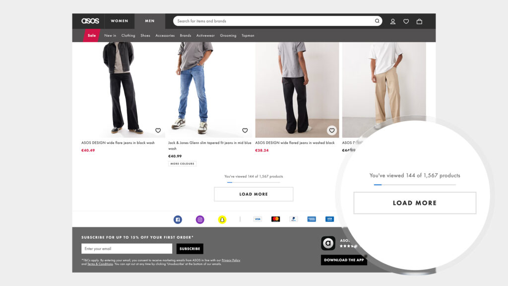
ASOS combines a prominent “Load More” button with two elements that most stores skip:
- A product counter — “Showing 72 of 348 products” — giving users an immediate sense of catalog depth
- A progress bar — a visual indicator showing how far through the total catalog they’ve browsed
These two additions solve load more’s only real weakness: the lack of orientation. Users instantly understand how much they’ve seen, how much is left, and whether it’s worth continuing to scroll. It transforms a simple button into an honest communication tool.
We’d argue this combination — load more + counter + progress bar — is the gold standard of ecommerce collection navigation in modern web. It respects the user’s time, supports their decision-making, and manages expectations honestly. It’s also better for SEO than pure infinite scroll. Brands looking for the best UX outcome should be looking here.
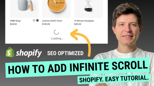
How to add infinite scroll or load more to your Shopify store
At this point you might be thinking about upgrading your store’s navigation. Here’s how to actually make it happen.
There are three realistic paths.
Option 1: Build it yourself with AI-generated code
It’s tempting. You paste a prompt into ChatGPT or Claude, get some JavaScript back, drop it into your theme, and call it done. For a basic proof of concept, this can work.
But in practice, there are meaningful risks. Custom code has to account for your specific theme’s HTML structure — selectors, containers, and grid layouts vary widely across themes, and code that works on one theme may break silently on another. More importantly, Shopify regularly updates its platform, and custom JavaScript that works today can fail after a platform update. You’ll have no automatic fix, no support, and often no warning. The SEO implementation — the crawlable pagination links that protect your search rankings — requires careful, precise implementation that generic AI code often gets wrong or skips entirely. What looks like a free solution often carries a quiet long-term maintenance cost.
Option 2: Hire a developer
A good Shopify developer will build something that actually fits your theme and handles edge cases. But this has its own tradeoffs.
The upfront cost is real. More importantly, the ongoing cost tends to surprise people: Shopify updates, theme updates, and changes to your store layout will periodically require revisiting the code. Each time something breaks or needs adjusting, you’re back in the development queue. For a feature that needs to work reliably every day across your entire catalog, the “custom build” path tends to be more expensive over time than it first appears.
Option 3: Use a dedicated Shopify app
This is what most stores with real traffic end up choosing, and for good reason.
A purpose-built app is maintained continuously by developers who track Shopify platform changes and update the code proactively. When Shopify rolls out an update, you don’t have to do anything — the app handles it. When something doesn’t work on your theme, support is available.
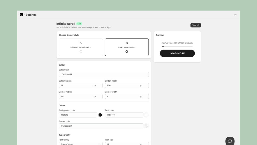
For adding infinite scroll and load more to Shopify collection pages, Fab Infinite Scroll is one of the most capable options available.
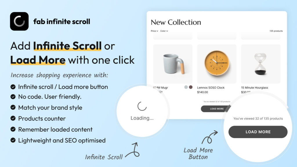
It gives you both navigation modes — infinite scroll and a customizable load more button — in a single app, with no coding required. Setup takes a few minutes. Key features worth highlighting:
- SEO-optimized by design — the app preserves crawlable pagination links in the HTML, following Google’s recommendations for paginated content. Crawlers see the same pagination they always did; users get a seamless experience. This is implemented correctly out of the box, not as an afterthought.
- Product counters — show shoppers “You’ve viewed 60 of 240 products,” the same feature that makes ASOS’s implementation so effective
- Back navigation memory — when a customer visits a product and hits back, they return to exactly where they left off in the catalog, not the top of the page. This is the detail that most implementations get wrong.
- Full style customization — button colors, typography, animation style (spinner, dots, pulse, wave), loading text position — everything matches your brand, not a generic template
- Mobile-optimized — works correctly on touch devices where scroll behavior differs from desktop
- Compatible with most themes — works automatically with the majority of Shopify themes, and if you’re on a custom or legacy theme, the support team will help configure it for your specific setup
The combination of correct SEO implementation, product counters, and back-navigation memory puts it in the same category as what large brands ship with significant engineering investment — available to any Shopify store, regardless of size. If you want a step-by-step walkthrough of the setup process, we’ve put together a quick guide here.
Conclusion
The data from 100 top brands is clear: pagination is no longer the standard. The question isn’t really whether to move to infinite scroll or load more — it’s which one fits your store and how to implement it properly.
For most Shopify stores with catalog sizes between 50 and 1,000 products, the load more button with a product counter is probably the smartest default. It maximizes product discovery, respects the user’s attention, keeps the footer accessible, and handles SEO the cleanest. For highly visual brands in fashion and beauty with scrolling-first audiences, infinite scroll is a proven choice — provided the SEO and back-navigation details are handled correctly.
What both approaches share is the same underlying logic: the brands winning in ecommerce have recognized that how you present your catalog is part of the product experience. Getting customers to see more of what you sell — without friction, without confusion, without losing them to a page reload — is a conversion lever. One that most stores are still leaving on the table.
Methodology: We manually reviewed the collection and category pages of all 100 brands in June–July 2026. Navigation type was determined by direct observation of each store’s primary product listing page. Stores with very small catalogs not requiring any pagination were replaced with better-fit alternatives. Data reflects implementations at time of review and may change as brands update their storefronts.